
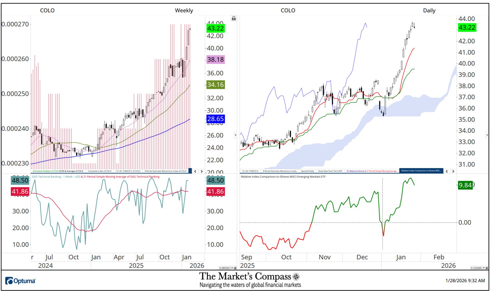
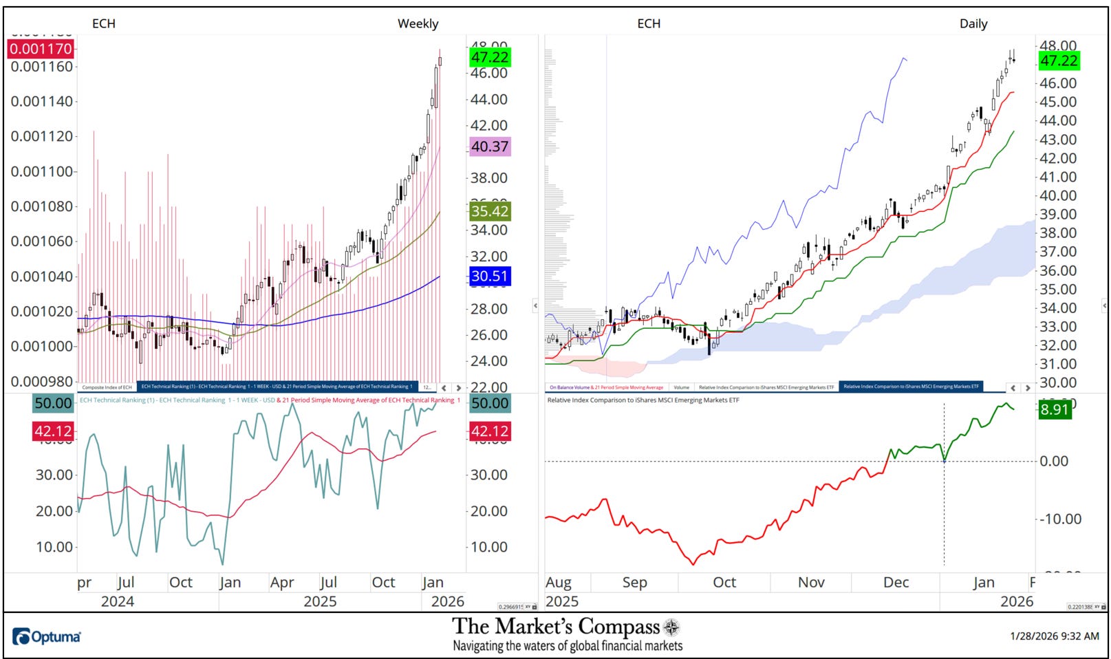
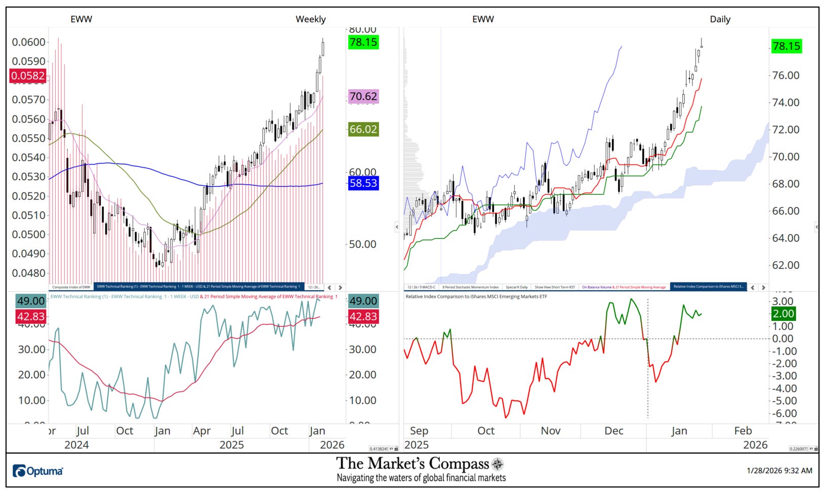
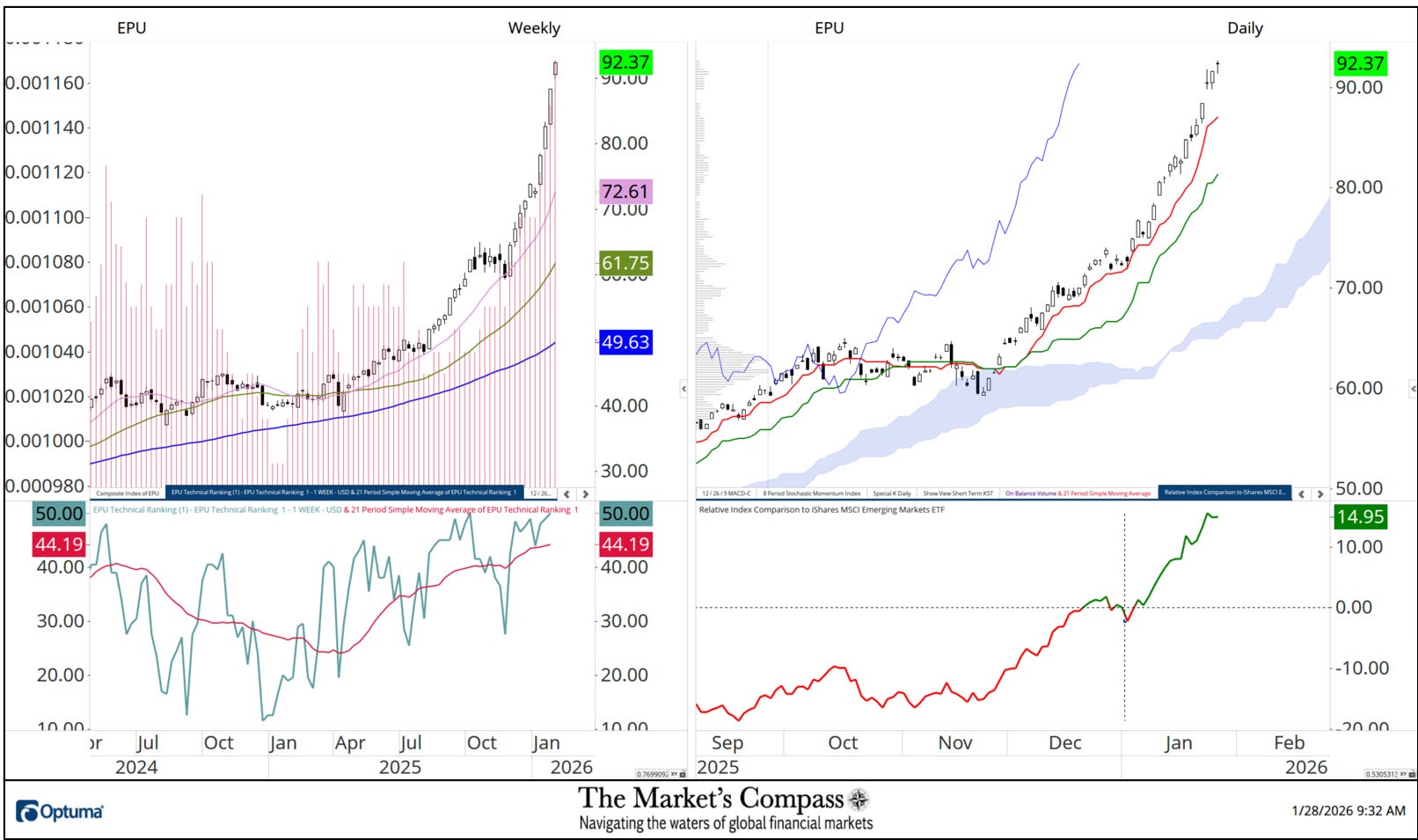
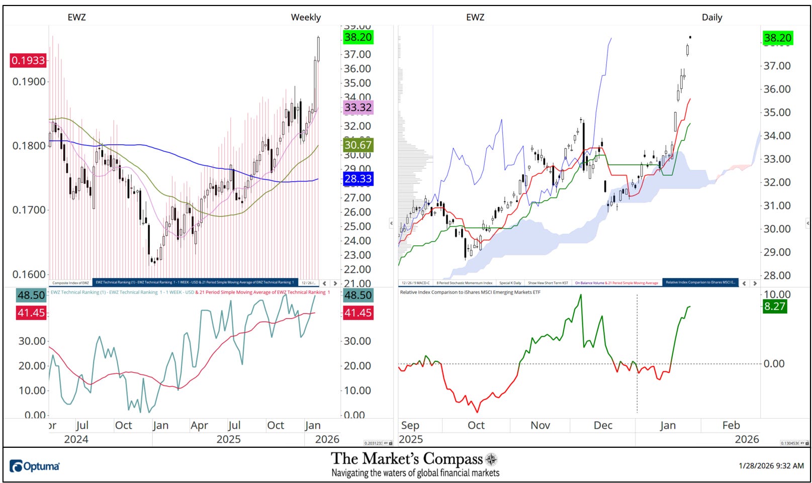
What follows are the charts of the five Lat/AM that I track in the Market’s Compass Emerging Markets Country ETF Studies that is sent to my paid subscribers. This is a “one off” that focuses on the currencies of the five ETFs that is posted on the Weekly charts as a histogram (red horizontal lines) on the left as well in the lower panel of the Weekly chart is my Objective Technical Ranking which is the backbone of the EM Studies that can range between 0 and 50.
To understand the methodology used in constructing the objective EM Country ETF Individual Technical Rankings visit the Markets Compass technical indicators page at www.themarketscompass.com and select “em country etfs”. What follows is a Cliff Notes version* of the full explanation of the methodology I use…
*The technical ranking system is a quantitative approach that utilizes multiple technical considerations that include but are not limited to trend, momentum, measurements of accumulation / distribution and relative strength of each individual 20 EM Country ETFs that can range between 0 and 50.
To the right of the Weekly Chart is a Daily Cloud chart. In the lower panel of that chart is Relative Index Comparison Line vs. the iShares Emerging Markets ETF or EEM that highlights the outperformance vs. the EEM starting at the beginning of the year (black dashed crosshairs). Although the outperformance numbers are not shown as a % per se, the numbers to the right are the outperformance percentage. For example, the Global X Columbia ETF which is the first chart presented is up 9.84% vs. the EEM since start of the year. Of the three geographic regions that are covered in the Emerging Markets Country ETF Studies that cover 20 ETFs that represent Asia/Pacific, EMEA and Latin America, Lat/Am has by far outperformed the other two regions since the start of the year.
There are three ETF Studies that include the Market’s Compass US Index and Sector (USIS) ETF Study, the Developed Markets Country (DMC) ETF Study and the Emerging Markets Country (EMC) ETF Study that in total cover 71 ETFs. The three Studies are normally published every three weeks and are sent to my paid Substack subscriber’s email. There is also a Weekly publication that is sent to paid subscribers every Sunday titled The Market’s Compass Crypto Sweet Sixteen Study that tracks the technical condition of sixteen of the larger cap Cryptocurrencies.
Charts and price data are courtesy of Optuma. Any time series data including my ETF Technical Rankings can be imported, charted, and back tested in Optuma*.
*Tip of the hat to Darren Hawkins at Optuma for his assistance in structuring the Relative Strength panels.
The following links are an introduction and an in-depth tutorial on RRG Charts…


 | Overview | CoinPayments")


")
